Performance Data Visualization
Timeline Charts
A very common chart type used in event-based performance analysis is the so-called timeline chart. This chart type graphically presents the chain of events of monitored processes or counters on a horizontal time axis. Multiple timeline chart instances can be added to the Trace View window via the Chart menu or the Charts toolbar.
Note: To measure the duration between two events in a timeline chart Vampir provides a tool called Ruler. The Ruler is enabled by default during every zoom operation in a timeline chart. In order to use the Ruler for measurement only, i.e. without performing any zoom, hold the Shift key pressed while clicking on any point of interest in a timeline chart and moving the mouse while holding the left mouse button pressed. A ruler like pattern appears in the timeline chart which provides the exact time between the start point and the current mouse position.
Master Timeline and Process Timeline
Master Timeline
Process Timeline
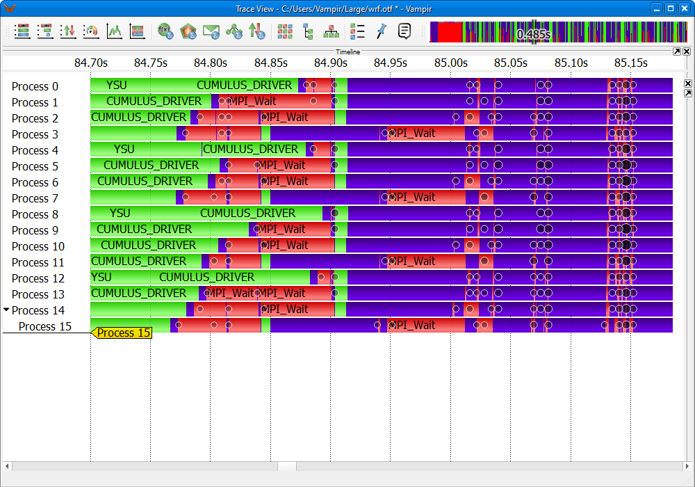
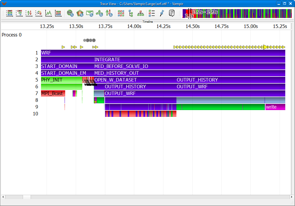
In the Master Timeline and the Process Timeline detailed information about functions, communication, and synchronization events is shown. Timeline charts are available for individual processes (Process Timeline) as well as for a collection of processes (Master Timeline). The Master Timeline consists of a collection of rows. Each row represents a single process, as shown in Figure LINK. A Process Timeline shows the different levels of function calls in a stacked bar chart for a single process as depicted in Figure LINK.
Every timeline row consists of a process name on the left and a colored sequence of function calls or program phases on the right. The color of a function is defined by its group membership, e.g., MPI_Send() belonging to the function group MPI has the same color, presumably red, as MPI_Recv(), which also belongs to the function group MPI. Clicking on a function highlights it and causes the Context View display to show detailed information about that particular function, e.g., its corresponding function group name, time interval, and the complete name. The Context View display is explained in Chapter LINK.
Some function invocations are very short. Hence these are not shown in the overall view due to a lack of display pixels. A zooming mechanism is provided to inspect a specific time interval in more detail. For further information on zooming see Section LINK. If zooming has been performed, scrolling in horizontal direction is possible with the mouse wheel or the scroll bar at the bottom.
The Process Timeline resembles the Master Timeline with slight differences. The chart's timeline is divided into levels, which represent the different call stack levels of function calls. The initial function begins at the first level, a sub-function called by that function is located a level beneath and so forth. If a sub-function returns to its caller, the graphical representation also returns to the level above.
In addition to the display of categorized function invocations, Vampir's Master- and Process Timeline also provide information about communication events. Messages exchanged between two different processes are depicted as black lines. In timeline charts, the progress in time is reproduced from left to right. The leftmost (starting) point of a message line and its underlying process bar therefore identify the sender of the message, whereas the rightmost position of the same line represents the receiver of the message. The corresponding function calls usually reflect a pair of MPI communication directives like MPI_Send() and MPI_Recv(). Collective communication like MPI_Gatherv() is also displayed in the Master Timeline as shown in Figure LINK.

Selected MPI Collective in Master Timeline
Furthermore, additional information like message bursts, markers and I/O events is available. Table LINK shows the symbols and descriptions of these objects.
| Symbol | Description |
Message Burst Collective Operation Burst  | Vampir depicts overlapping communication events like messages and collective operations as so-called bursts. Message bursts are depicted as circles and collective bursts as rhombuses. The amount of aggregated events is encoded in the visualization. The larger and darker the shape, the more events are aggregated. In this representation, it is not visible which processes send or receive the aggregated messages or participated in the collective operations of one burst. For message bursts, it is however possible to click on a specific burst. Then, the clicked burst is marked as a green circle and all sending or receiving processes are marked with red circles. Zooming into burst intervals eventually reveals the corresponding single events. |
Markers multiple multiple single single | To indicate particular points of interest during the runtime of an application, like errors or warnings, markers can be placed in a trace file. They are drawn as triangles which are colored according to their types. To indicate that two or more markers are located at the same pixel, a tricolored triangle is drawn. |
I/O Events   | Vampir highlights I/O operations if I/O performance data has been recorded in the trace file. In general, I/O operations are indicated by triangular icons (yellow by default). Clicking on the icon provides details about the operation in the Context View window. When selected, a second triangle to the right indicates the completion of the given operation. Icons can overlap when dealing with dense I/O activity (I/O event burst). The size of an icon therefore relates to the number of represented I/O operations, i.e. the icon is big if many operations are represented and small if only a few operations take place. Individual I/O operations are clearly marked with a dot in the center of the icon. Zooming into I/O bursts eventually reveals the corresponding individual I/O operations. |
Additional Information in the Master and Process Timeline
Since the Process Timeline reveals information of one process only, short black arrows are used to indicate outgoing communication. Clicking on message lines or arrows shows message details like sender process, receiver process, message length, message duration, and message tag in the Context View display.
Search for MPI_Bcast in the Master Timeline
Active overlay showing PAPI_FP_OPS in the Master Timeline
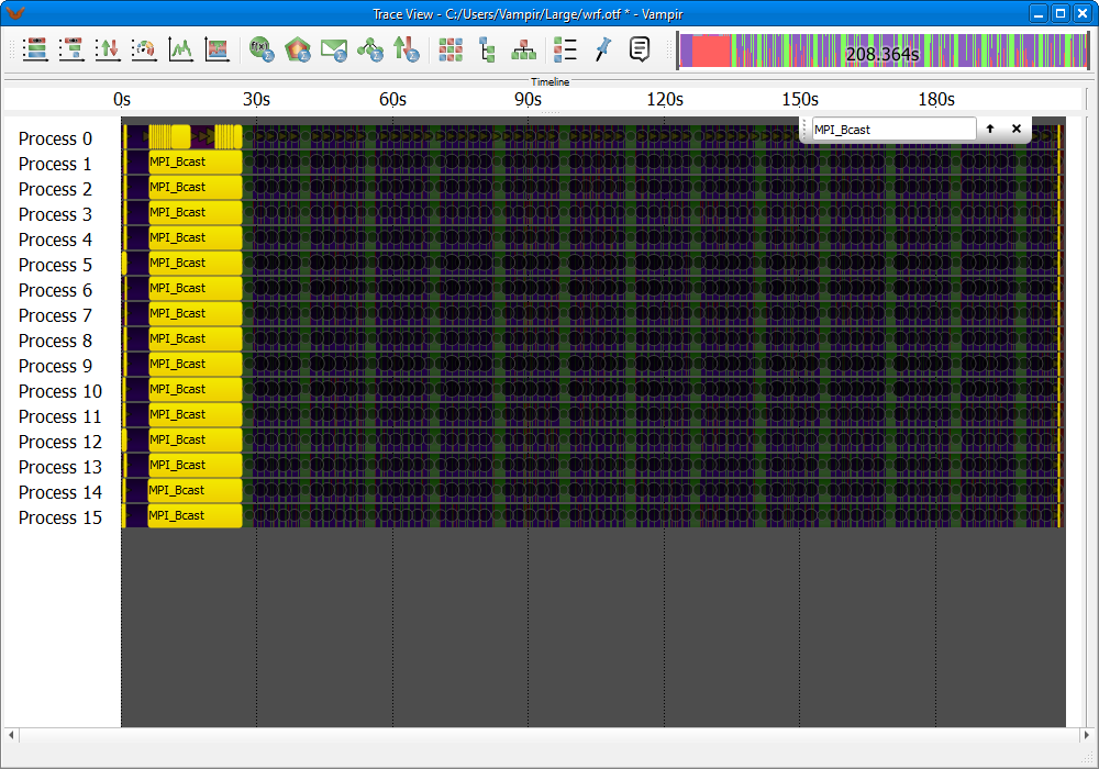
The Master Timeline also provides the possibility to search for function and function group occurrences. In order to activate the search mode use the context menu and select Find.... After activation an input field appears at the top of the Master Timeline. A search string can be written in this field and all corresponding function and function group occurrences are highlighted in yellow in the Master Timeline. An example search for the function MPI_Bcast is depicted in Figure LINK.
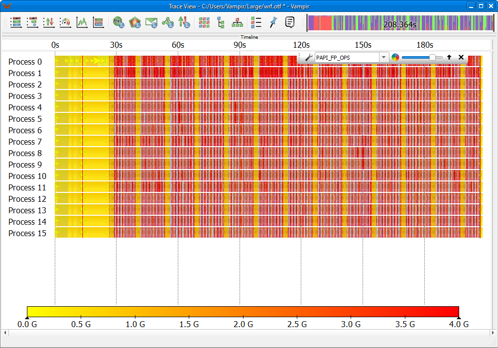
Furthermore, the Master Timeline also features an overlay mode for performance counter data, Figure LINK. In order to activate the overlay mode use the context menu Options -> Performance Data. When the overlay mode is active a control window appears at the top of Master Timeline. It allows to select the displayed counter data (metric). The counter data is displayed in a color coded fashion like in the Performance Radar, Section LINK. The color scale can be freely customized by clicking on the wrench icon. The control window also provides an opacity control slider. This slider allows to adjust the opacity of the overlay and thus makes the underlying functions easily visible without the need to disable the overlay mode.
Summary Timelines
Summary Timeline charts divide the current zoom interval into equal-sized vertical histograms and display a specific summary metric for each. This chart is useful for studying changes in the behavior of the application over time or finding phases of specific activities from a high-level perspective. Vampir provides summary timelines for function activities LINK, messages LINK, and I/O events LINK.
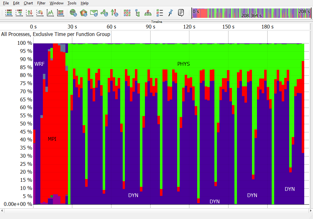
Function Summary Timeline
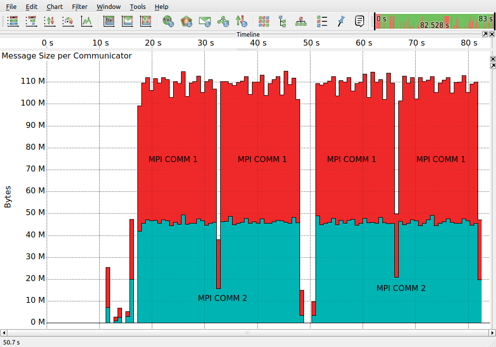
Message Summary Timeline
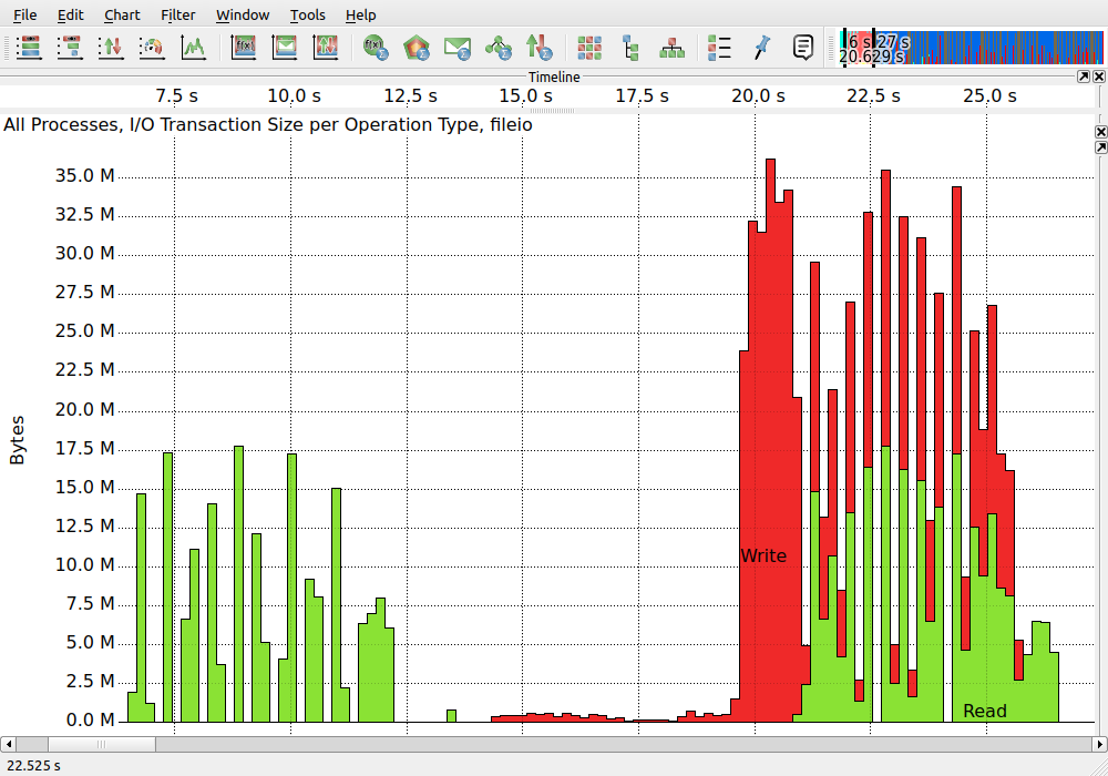
I/O Summary Timeline
The context menu entry Set Step Size alters the width (represented duration) of the histogram bars. This allows to adjust for finer-/coarser accumulation of values.
The Set Metric sub-menu of the context menu makes it possible to switch between the available metrics depending on the chart:
The group base can be chosen via the menu entry Group By and sorting can be selected via the context menu option Sort By.
For the Function Summary Timeline, the displayed colors represent corresponding functions or function groups. The context menu entry Set Functions... specifies the set of functions that is displayed in the chart. The context menu entry Options -> Group Functions aggregates functions and displays them as function groups.
For the Message and I/O Summary Timeline, the displayed colors depend on the selected grouping and the coloring mode in the Appearance Settings (LINK).
Using the Process Filter, see Section LINK, allows to restrict this chart to a freely selectable set of processes. As a result, only the consumed time of these processes is displayed for each function or function group. Instead of using the filter which affects all other displays by hiding processes, it is possible to select a single process via Set Process in the context menu. This does not have any effect on other charts.
Counter Data Timeline
Counters are values collected over time to count certain events like floating point operations or cache misses. Counter values can be used to store not just hardware performance counters but arbitrary sample values. There can be counters for different statistical information as well, for instance counting the number of function calls or a value in an iterative approximation of the final result. Counters are defined during the instrumentation of the application and can be individually assigned to processes.
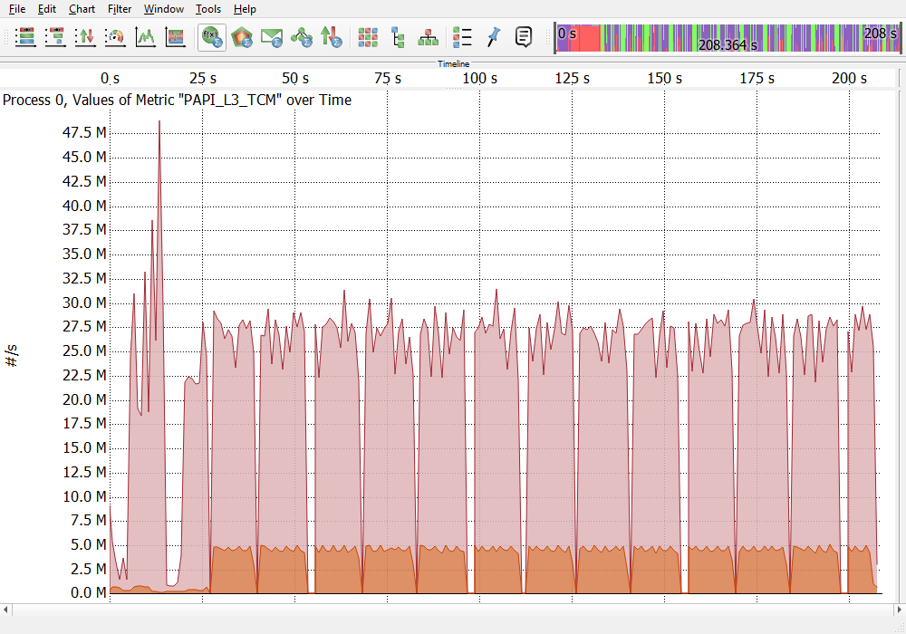
Counter Data Timeline
An example Counter Data Timeline chart is shown in Figure LINK. The chart is restricted to one counter at a time. It shows the selected counter for one measuring point (e.g., process). Using multiple instances of the Counter Data Timeline, counters or processes can be compared easily.
The displayed graph in the chart is constructed from actual measurements (data points). Since display space is limited it is likely that there are more data points than display pixels available. In that case multiple data points need to be displayed on one pixel (width). Therefore the counter values are displayed in three graphs. A maximum line (red), an average line (yellow), and a minimum line (blue). When multiple data points need to be displayed on one pixel width, the red line shows the data point with the highest value, the blue line shows the point with the lowest value, and the yellow line indicates the average of all data points lying on this pixel width. When zooming into an smaller time range less data points need to be displayed on the available pixel space. Eventually, when zooming far enough only one data point needs to be display on one pixel. Then also the three graphs will merge together. The actual measured data points can be displayed in the chart by enabling them via the context menu under Options....
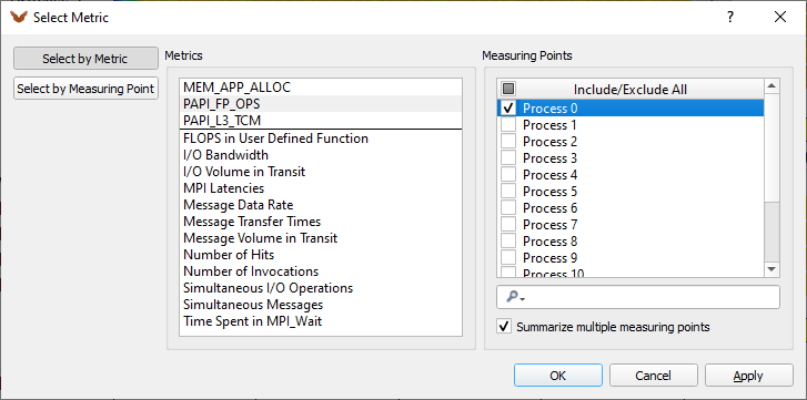
Select metric dialog
The context menu entry Select Metric... opens the selection dialog depicted in Figure LINK. This dialog allows to choose the displayed counter in the chart. Each counter is defined by its metric and its measuring point. Note, depending on the measurement not all metrics might be available on all measurement points.
The two left buttons in the dialog decide whether the counter should be selected by metric or by measuring point first. In the case of Select by Metric there is also the option to Summarize multiple measuring points available. This option allows to identify outlier by summarizing counters (e.g., PAPI_FP_OPS) over multiple measuring points (e.g., processes). Hence, when this option is active multiple measuring points can be selected. The counter for the selected metric is then summarized over all selected measuring points. The displayed counter graphs in the chart need then to be read as follows. The yellow average line in the middle displays the average value (e.g., PAPI_FP_OPS) of all selected measuring points (e.g., processes) at a given time. The red maximum line shows the highest value that one of the selected measuring points achieved at a given time. The blue minimum line shows the smallest value that one of the selected measuring points (e.g., process) achieved at a given time. A click with the left mouse button on any point in the chart reveals its details in the Context View display. Stated are the min, max, and average values and the measurement points (e.g., processes) that achieved maximum and minimum values at the selected point in time.
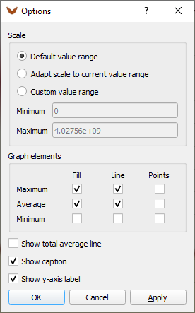
Counter Timeline options dialog
The options dialog is depicted in Figure LINK. It can be enabled via the context menu under Options.... It provides the possibility include/exclude the graphs, lines and data points from the chart. It is also possible to enable an average line showing the average value of all data points in the visible area.
The counter type setting is used to determine how the data points should be connected. This is dependent on the type of the counter and usually predefined during the recording of the trace data. Nevertheless, this setting can also be changed afterwards in Vampir.
The Counter Data Timeline chart allows to create custom metrics. This process is described in Section LINK. Created custom metrics become available in the Select Metric dialog.
Performance Radar
The Performance Radar chart, Figure LINK, displays counter data and provides the possibility to create custom metrics. In contrast to the Counter Data Timeline the Performance Radar shows one counter for all processes at once. The values of the counter are displayed in a color-coded fashion.
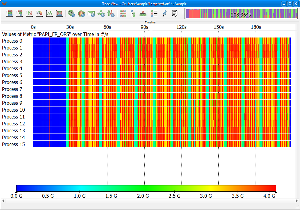
Performance Radar
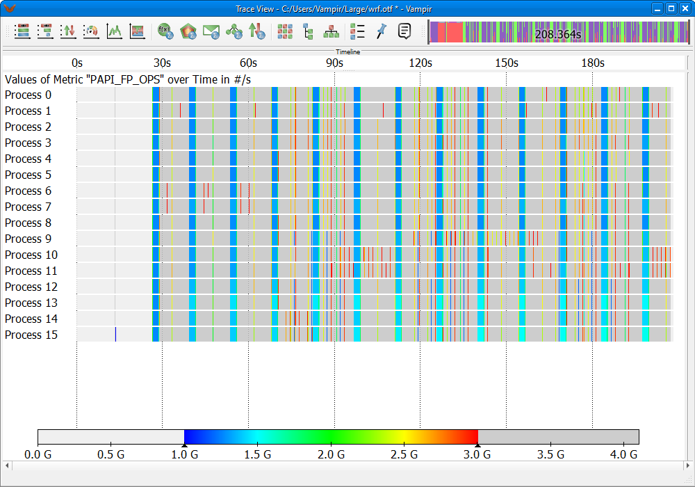
Adjusted value range in color scale
The displayed counter in the chart can be chosen via the context menu entry Set Metric. Own created custom metrics are listed under this option as well.
The option Adjust Bar Height to allows to change the height of the displayed value bars in the chart. This useful for traces with a large number of processes. Here the option Adjust Bar Height to -> Fit Chart Height tries to display all processes in the chart. This provides an overview of the counter data across the entire application run.
Set Chart Mode allows to define whether minimum, maximum, or average values should be shown. This setting comes into effect when multiple measured data points need to be displayed on one pixel. If Maximum or Minimum is active, the data point with the highest or lowest value is displayed, respectively. In case of Average the average of all data points on the respective pixel width is displayed. This procedure is also explained in section Counter Data Timeline LINK.
The value range of the color scale can be easily adjusted with the left mouse button. To adjust the color-coded value rage just drag the edges of the color scale to the desired positions. Figure LINK depicts the Performance Radar chart shown in Figure LINK with a smaller value range of 1G - 3G FLOPS. This allows to easily spot areas of high or low performance in the trace file. The selected value range can also be dragged to other positions in the color scale. A double-click with the left mouse button on the color scale resets the selected value range.
The option Options -> Color Scale... in the context menu of the chart allows to customize the color scale to the own preferences.
Master Timeline Overlay Mode

Master Timeline with active performance data overlay
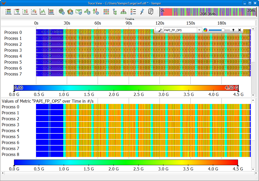
Master Timeline (top chart) and Performance Radar (bottom chart) displaying the same PAPI_FP_OPS counter
Figure LINK shows an overview of the performance data overlay mode available in the Master Timeline chart. The overlay is capable of displaying all metrics available in the Performance Radar chart and the Counter Data Timeline chart. It is activated via the chart's context menu under Options->Performance Data. When the overlay mode is active, a control window appears at the top of Master Timeline chart. It allows to configure the overlay and to select the displayed performance data (metric).


Image series showing different opacity settings for the performance data overlay, going from zero opacity in the top image to full opacity in the bottom image
The selected metric is shown in a color-coded fashion like in the Performance Radar chart. Figure LINK depicts the Master Timeline chart (top) and the Performance Radar chart (bottom), both displaying the same performance metric PAPI_FP_OPS (floating point operations per second). As can be seen, the overlay mode provides the performance data visualization capabilities of the Performance Radar for the Master Timeline. To fully benefit from this combination the opacity slider of the overlay control window should be used, see Figure LINK. The slider allows to quickly manipulate the opacity of the overlay and thus making underlying functions visible. This is particularly useful for first pinpointing performance relevant areas and then directly analyzing the individual identified functions in the Master Timeline.
The color scale of the performance data overlay is freely customizable. Clicking the wrench icon in the overlay control window opens the color scale options dialog. The color scale provides three modes: Default, Highlight, and Find. Additionally, the Custom mode allows to manually adapt the color scale to the own preferences.
Defining own Performance Metrics
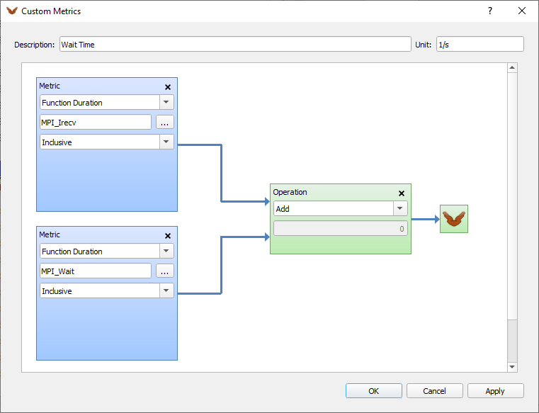
Custom metrics editor showing the construction of a custom Wait Time metric; The metric is defined by the addition of the duration of MPI_Irecv and MPI_Wait functions
The Custom Metrics Editor allows to derive own metrics based on existing counters and functions. This is particularly useful as the performance data overlay of the Master Timeline, Section LINK, is capable of displaying the own metrics. The editor is accessible via the context menu entry Customize Metrics... in the Performance Radar or the Counter Data Timeline chart. Figure LINK shows an example construction of a custom metric Wait Time. This metric is an addition of the time spent in the functions MPI_Irecv and MPI_Wait. Custom metrics are build from input metrics that are linked together using a set of available operations. In the editor the context menu accessible via the right mouse button allows to add new input metrics and operations. All created custom metrics become available in the Set Metric selections of the Performance Radar and Counter Data Timeline charts. There are available as well in the overlay mode of the Master Timeline. Custom metrics can be exported and imported in order to use them in multiple trace files.
Examples
This chapter illustrates the usage of the Performance Radar chart and the Master Timeline overlay in a few examples. The creation and highlighting of custom metrics is also explained. The trace file used for the examples shows a WRF weather forecast code run. The timelines show the initialization in the beginning followed by a number of compute iterations. Figure LINK depicts this trace file. The top image shows the pure timelines of the Master Timeline chart, the bottom image shows the values of the PAPI_FP_OPS counter superimposed on the timelines. Here, the red areas indicate high computational activity and therefore mark the compute iterations.
High and Low FLOP Rate
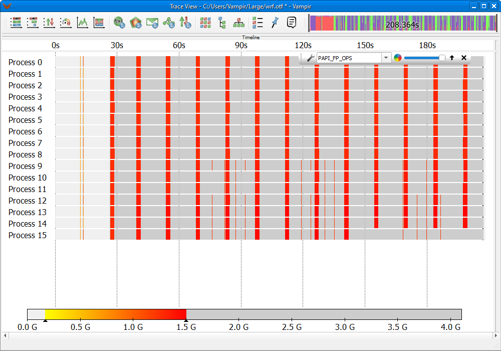
Highlighted areas with a low FLOP rate
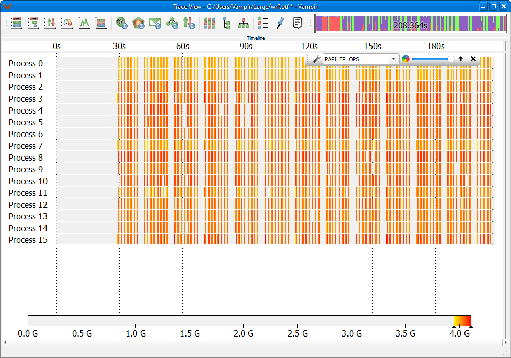
Highlighted areas with a high FLOP rate
In order to analyze the FLOP rate, the overlay mode of the Master Timeline is configured to show the performance counter PAPI_FP_OPS. To identify functions with a high or low FLOP rate the value range of the color scale can be limited. This is done by dragging the edges of the colored area of the scale to the desired minimum/maximum values. That way only values inside the chosen range appear color-coded in the chart. Outside values are visualized in gray.
Figure LINK and Figure LINK depict two examples. Functions with a low FLOP rate are highlighted in Figure LINK. The color scale is limited to a range between 100M and 1.6G FLOPS. The minimum value is raised to 100M in order to gray out non-computing functions like MPI. In Figure LINK all areas with a low FLOP rate are highlighted in red. In this example these areas represent functions in the beginning of each iteration. Functions with a high FLOP rate are highlighted in Figure LINK. Here the color scale is set to highlight only areas with the highest FLOP rate. These areas are represented by functions in the compute iterations.
Memory Allocation
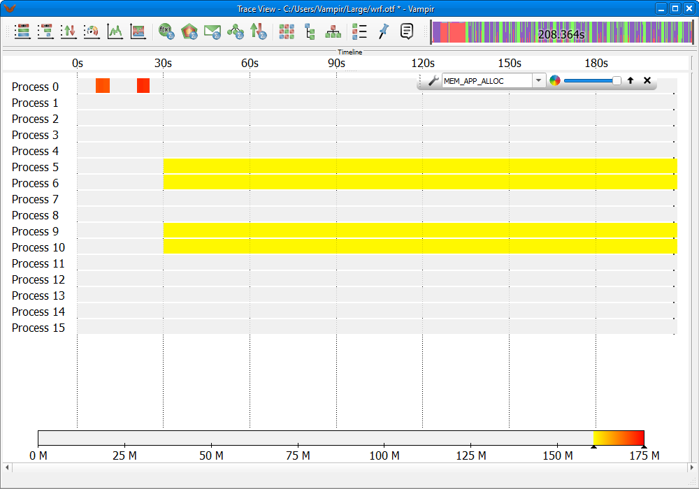
Functions with 160MB - 175MB allocated memory
The performance data overlay can also be used to identify functions with a certain amount of allocated memory. Figure LINK shows an example. Here functions that have between 160MB and 175MB memory allocated are highlighted. The highlighted range of allocated memory can be easily changed by adjusting the color scale value range.
MPI_Wait Duration
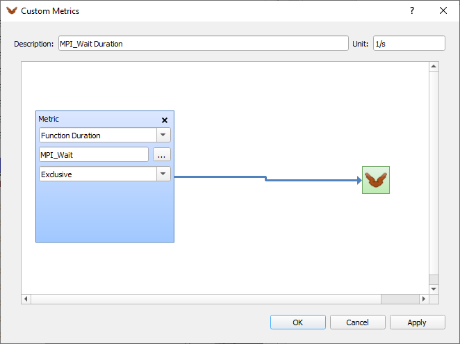
Construction of a custom metric showing the MPI_Wait duration
In Vampir it is also possible to identify long running functions. In this example long running invocations of the function MPI_Wait are highlighted.
First step is to construct a custom metric showing the MPI_Wait duration time. The custom metric editor is described in more detail in Section LINK. The constructed custom metric is depicted in Figure LINK.
Then the performance data overlay is used to show the own metric in the Master Timeline, Figure LINK. The color scale is configured to show only MPI_Wait invocations with a high duration. After identification of the areas with the highest duration (deep red), zooming into such an area will eventually reveal the respective MPI_Wait invocations. Using the opacity slider, Figure LINK, the individual function occurrences become visible in the Master Timeline.
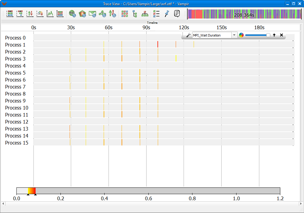
MPI_Wait invocations with longest duration
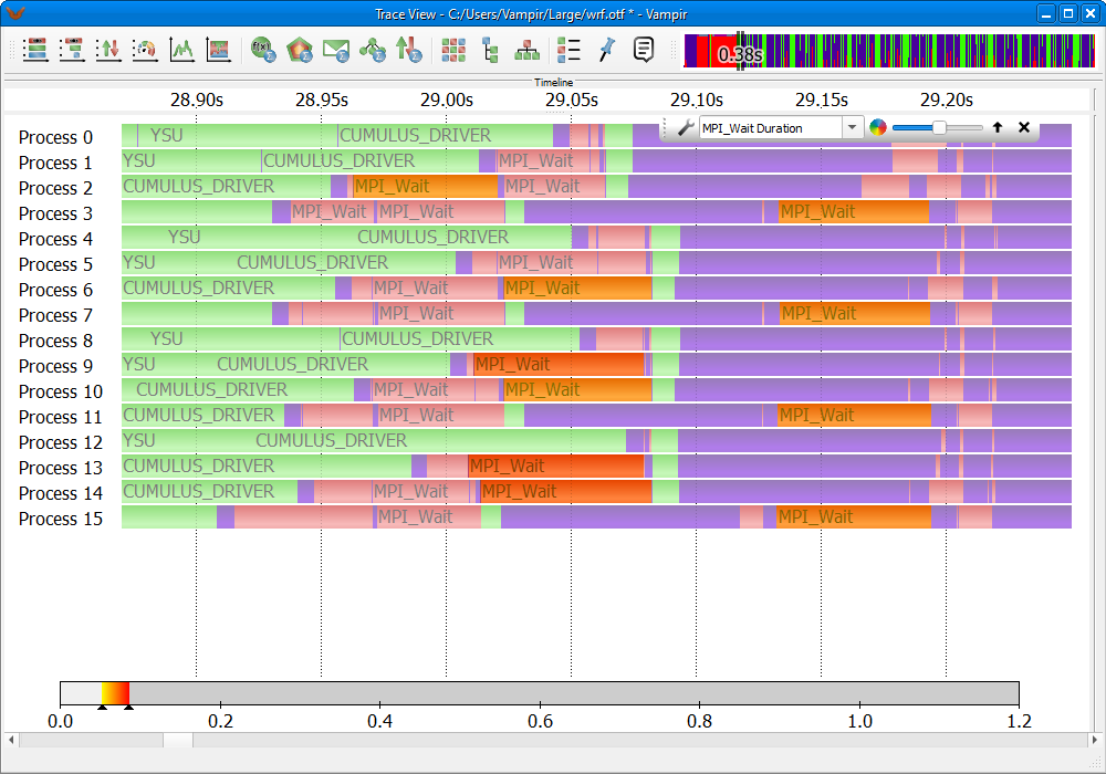
Using the opacity slider to reveal MPI_Wait invocations in the timeline together with the superimposed, color-coded duration
FLOPS of SOLVE_EM
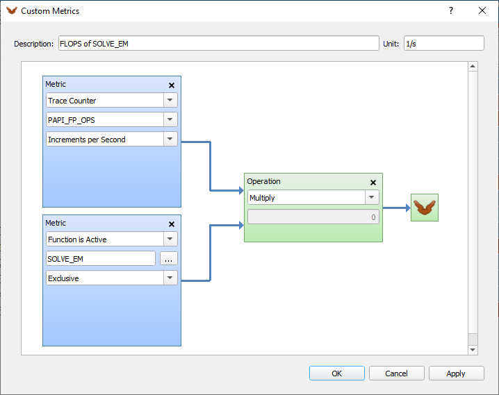
Custom metric showing FLOPS only for function SOLVE_EM
Vampir also allows to search for invocations of individual functions below or above a certain threshold. In this example invocations of the function SOLVE_EM with a FLOP rate above 150M are searched.
Therefore the first step is to construct a custom metric showing the FLOP rate only for the function SOLVE_EM. The process of constructing a custom metric is described in more detail in Section LINK. The constructed custom metric is depicted in Figure LINK.
Figure LINK shows the constructed metric in the overlay. The color scale is set to highlight only functions above 150 M FLOPS. When zooming into an area of interest the opacity slider can be used to reveal individual function invocations in the timeline, Figure LINK.
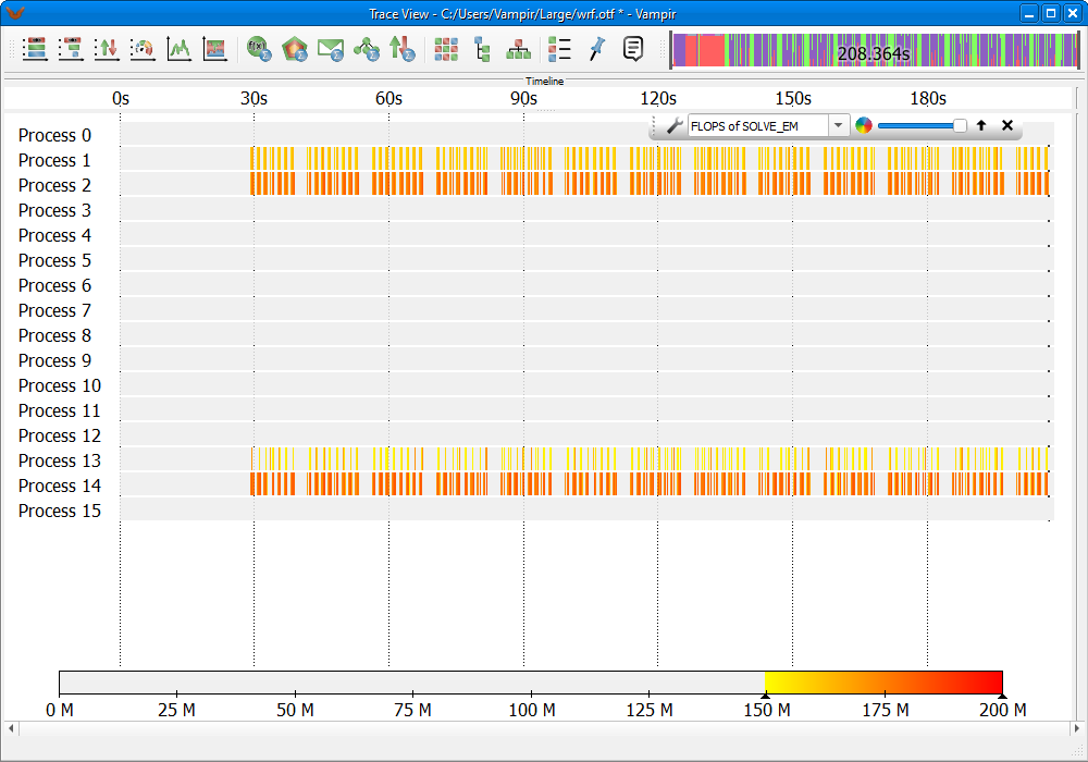
SOLVE_EM invocations with highest FLOP rate
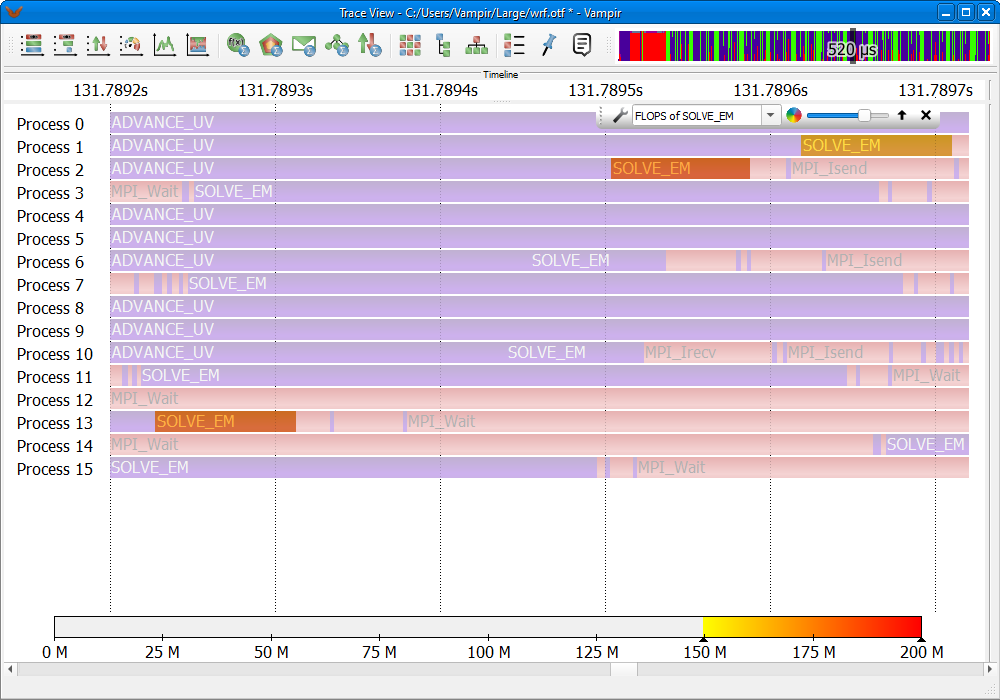
Using the opacity slider to investigate individual invocations of SOLVE_EM
Statistical Charts
Function Summary
The Function Summary chart, Figure LINK, gives an overview of the accumulated time consumption across all function groups and functions. For example every time a process calls the MPI_Send() function the elapsed time of that function is added to the MPI function group time. The chart gives a condensed view of the execution of the application. A comparison between the different function groups can be made and dominant function groups can be distinguished easily.
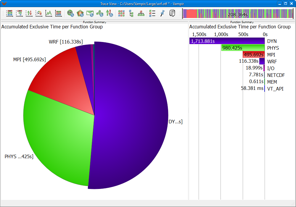
Function Summary
It is possible to change the information displayed via the context menu entry Set Metric that offers options like Average Exclusive Time, Number of Invocations, Accumulated Inclusive Time, etc.
Note: Inclusive means the amount of time spent in a function and all of its subroutines. Exclusive means the amount of time spent in just this function.
The context menu entry Set Event Category specifies whether function groups or functions should be displayed in the chart. The functions own the color of their function group.
It is possible to hide functions and function groups from the displayed information with the context menu entry Filter. In order to mark the function or function group to be filtered just click on the associated label or color representation in the chart. Using the Process Filter (see Section LINK) allows you to restrict this chart to a set of processes. As a result, only the consumed time of these processes is displayed for each function group or function. Instead of using the filter which affects all other displays by hiding processes, it is possible to select a single process via Set Process in the context menu of the Function Summary. This does not have any effect on other charts.
The Function Summary can be shown as Histogram (a bar chart, like in timeline charts) or as Pie Chart. To switch between these representations use the Set Chart Mode entry of the context menu.
The shown functions or function groups can be sorted by name or value via the context menu option Sort By.
Process Summary
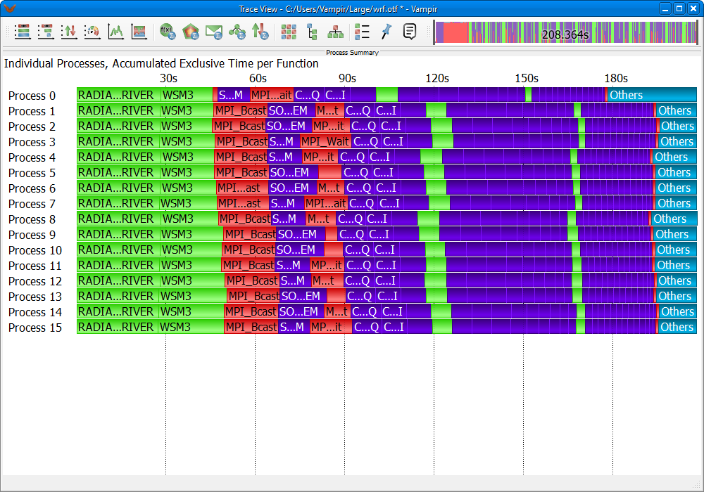
The Process Summary, depicted in Figure LINK, is similar to the Function Summary but shows the information for every process independently. This is useful for analyzing the balance between processes to reveal bottlenecks. For instance finding that one process spends a significantly high time performing the calculations could indicate an unbalanced distribution of work and therefore can slow down the whole application.
Process Summary
The context menu entry Set Event Category specifies whether function groups or functions should be displayed in the chart. The functions own the color of their function group.
The chart calculates statistics based on Number of Invocations, Accumulated Inclusive Time, or Accumulated Exclusive Time. To change between these three modes use the context menu entry Set Metric.
The number of clustered profile bars is based on the chart height by default. You can also disable the clustering or set a fixed number of clusters via the context menu entry Clustering by selecting the corresponding value in the spin box. Located left of the clustered profile bars is a graphical overview indicating the processes associated to the cluster. Moving the cursor over the blue areas in the overview opens a tooltip stating the respective process name.
It is possible to profile only one function or function group or to hide arbitrary functions and function groups from the displayed information. To mark the function or function group to be profiled or filtered just click on the associated color representation in the chart. The context menu entries Profile of Selected Function/(Group) and Filter Selected Function/(Group) will then provide the possibility to profile or filter the selected function or function group. Using the Process Filter (see Section LINK) allows you to restrict this view to a set of processes.
The context menu entry Sort by allows you to order function profiles by Number of Clusters. This option is only available if the chart is currently showing clusters. Otherwise function profiles are sorted automatically by process. While profiling one function the menu entry Sort by Value allows to order functions by their execution time.
Message Summary
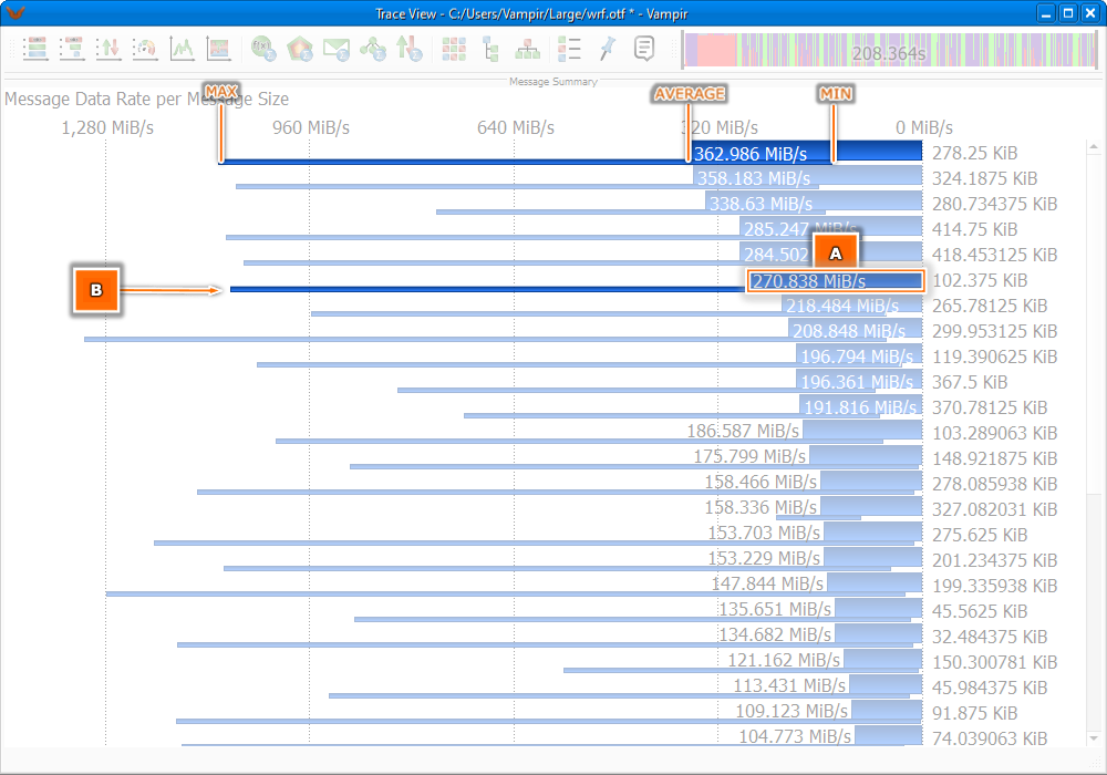
The Message Summary is a statistical chart showing an overview of all messages grouped by certain characteristics, Figure LINK.
Message Summary Chart with metric set to Message Transfer Rate showing the average transfer rate(A), and the minimal/maximal transfer rate(B)
All values are represented in a bar chart fashion. The number next to each bar is the group base while the number inside a bar depicts the values depending on the chosen metric. Therefore, the Set Metric sub-menu of the context menu can be used to switch between Aggregated Message Volume, Message Size, Number of Messages, and Message Transfer Rate.
The group base can be selected via the context menu entry Group By. Possible options are Message Size, Message Tag, and Communicator (MPI).
Note: There will be one bar for every occurring group. However, if the metric is set to Message Transfer Rate, the minimal and the maximal transfer rate is given in an additional small bar beneath the main bar showing the average transfer rate. The additional bar starts at the minimal rate and ends at the maximal rate, see Figure LINK.
In order to filter out messages click on the associated label or color representation in the chart and then choose Filter from the context menu.
Communication Matrix View
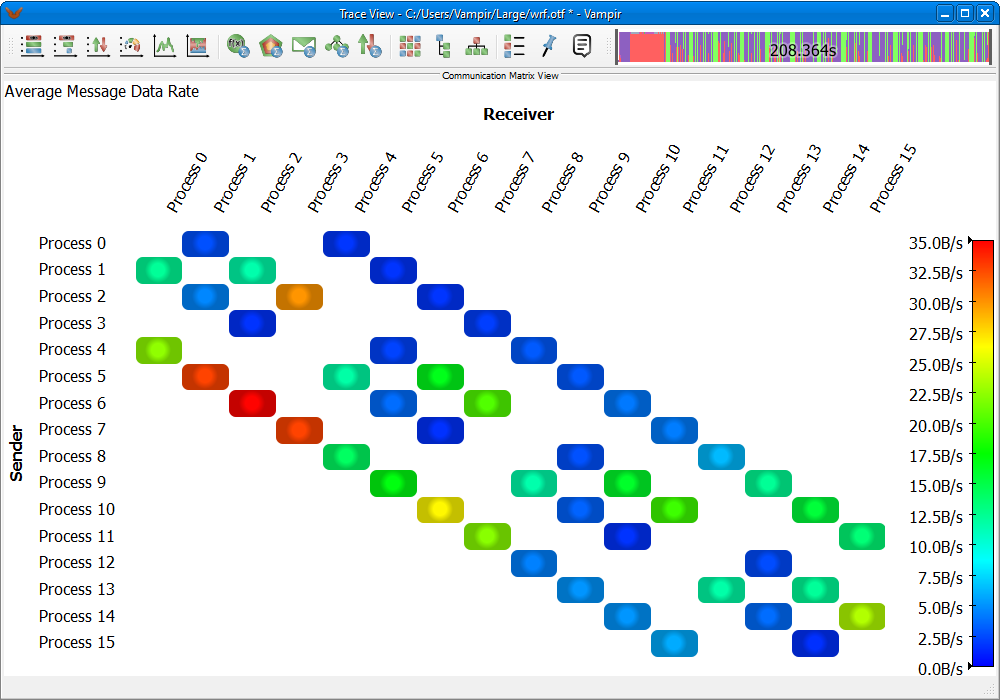
The Communication Matrix View is another way of analyzing communication imbalances. It shows information about messages sent between processes.
Communication Matrix View
The chart, as shown in Figure LINK, is figured as a table. Its rows represent the sending processes whereas the columns represent the receivers. The color legend on the right indicates the displayed values. It adapts automatically to the currently shown value range.
It is possible to change the type of displayed values. Different metrics like the average duration of messages passed from sender to recipient or minimum and maximum bandwidth are offered. To change the type of value that is displayed use the context menu option Set Metric.
Use the Process Filter to define which processes/groups should be displayed. (see Section LINK).
Note: A high duration is not automatically caused by a slow communication path between two processes, but can also be due to the fact that the time between starting transmission and successful reception of the message can be increased by a recipient that delays reception for some reason. This will cause the duration to increase (by this delay) and the message rate, which is the size of the message divided by the duration, to decrease accordingly.
I/O Summary
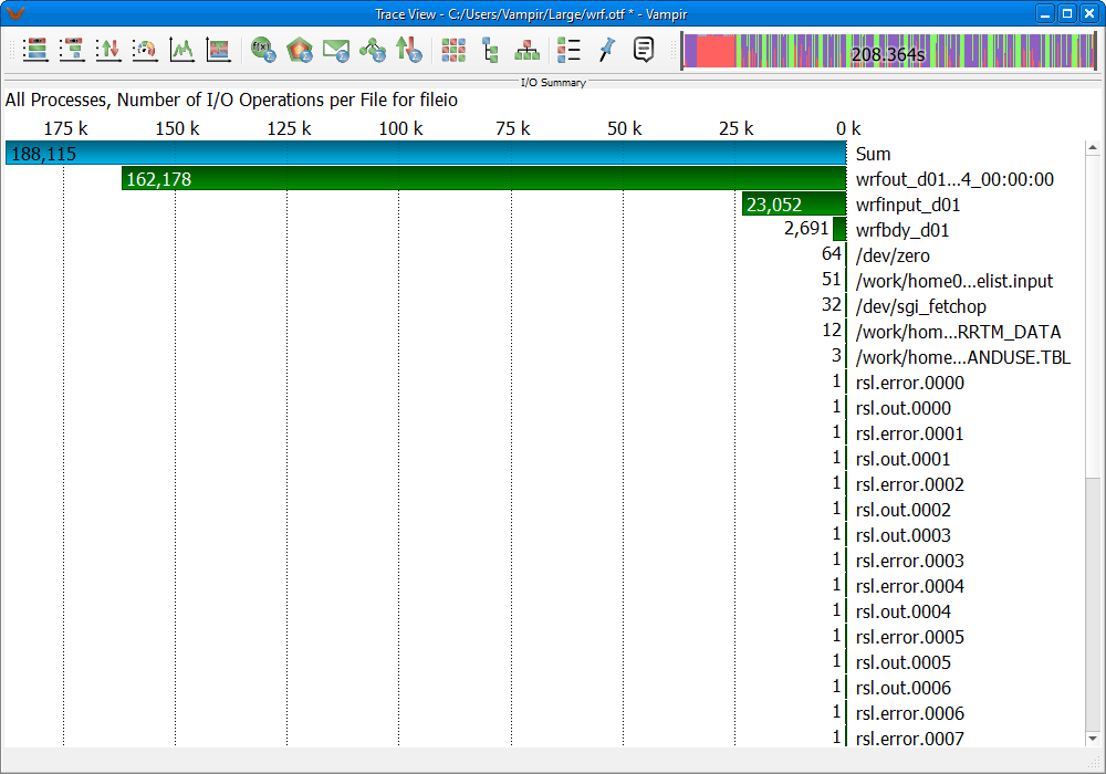
The I/O Summary, depicted in Figure LINK, is a statistical chart giving an overview of the input-/output operations recorded in the trace file.
I/O Summary
All values are represented in a histogram like fashion. The text label indicates the group base while the number inside each bar represents the value of the chosen metric. The Set Metric sub-menu of the context menu is used to switch between the available metrics Number of I/O Operations, Aggregated I/O Transaction Size, Aggregated I/O Transaction Time, and values of I/O Transaction Size, I/O Transaction Time, or I/O Bandwidth with respect to their selected value type. Therefore, one has the opportunity to switch between the value types Minimum, Average, Maximum, and Average \& Range via the context menu entry Set Value.
Note: There will be one bar for every occurring metric. Furthermore, the value type Average \& Range gives a quick and convenient overview and shows minimum, maximum, and average values at once. The minimum and maximum values are shown in an additional, smaller bar beneath the main bar indicating the average value. The additional bar starts at the minimum and ends at the maximum value of the metric, see Figure LINK.
The I/O operations can be grouped by the characteristics Transaction Size, File Name, and Operation Type. The group base can be changed via the context menu entry Group I/O Operations by.
In order to select the I/O operation types that should be considered for the statistic calculation use the Set I/O Operations sub-menu of the context menu. Available options are Read, Write, Read, Write, and Apply Global I/O Operations Filter. The latter includes all selected operation types from the I/O Events filter dialog, see Section LINK.
Call Tree
The Call Tree, depicted in Figure LINK, illustrates the invocation hierarchy of all monitored functions in a tree representation. The display reveals information about the number of invocations of a given function, the time spent in the different calls and the caller-callee relationship.
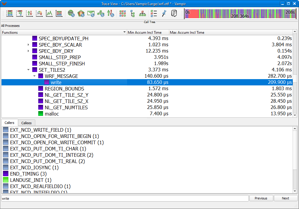
The entries of the Call Tree can be sorted in various ways. Simply click on one header of the tree representation to use its characteristic to re-sort the Call Tree. Please note that not all available characteristics are enabled by default. To add or remove characteristics use the Set Metric sub-menu of the context menu.
To leaf through the different function calls, it is possible to fold and unfold the levels of the tree. This can be achieved by double clicking a level, or by using the fold level buttons next to the function name.
Functions can be called by many different caller functions, what is hardly obvious in the tree representation. Therefore, a relation view shows all callers and callees of the currently selected function in two separated lists, shown in the lower area in Figure LINK.
In order to find a certain function by its name, Vampir provides a search option accessible via the context menu entry Find.... The entered keyword has to be confirmed by pressing the Return key. The Previous and Next buttons can be used to flip through the results.
Informational Charts
Function Legend
The Function Legend lists all visible function groups of the loaded trace file along with their corresponding color.
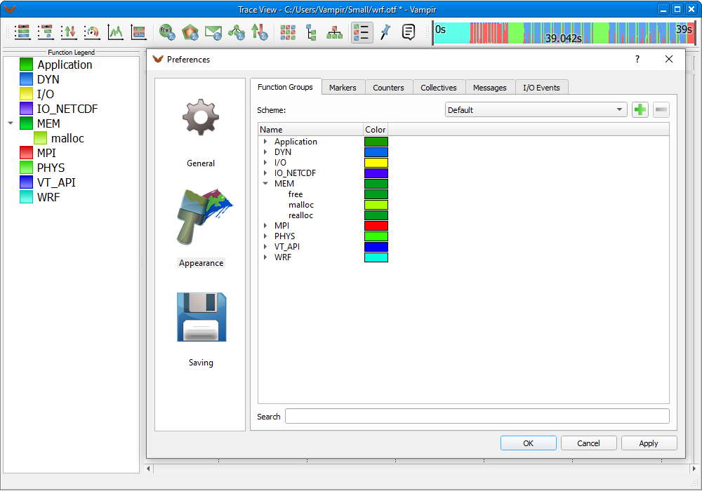
Function Legend
If colors of functions are changed, they appear in a tree like fashion under their respective function group as well, see Figure LINK.
Marker View
The Marker View lists all marker events included in the trace file.
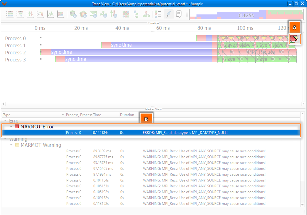
A chosen marker (A) and its representation in the Marker View (B)
The display organizes the marker events based on their respective groups and types in a tree like fashion. Additional information like the time of occurrence or descriptions are provided for each marker.
By clicking on a marker event in the Marker View this event becomes selected in the timeline displays. If this marker is located outside the visible area the zoom jumps to this event automatically. It is possible to select marker events by their type as well. Then all events belonging to that type are selected in the Master Timeline and the Process Timeline. By holding the Ctrl or Shift key pressed multiple marker events can be selected. If exactly two marker events are selected the zoom is set automatically to the occurrence time of the markers.
Context View
As implied by its name, the Context View provides detailed information of a selected object additional to its graphical representation.
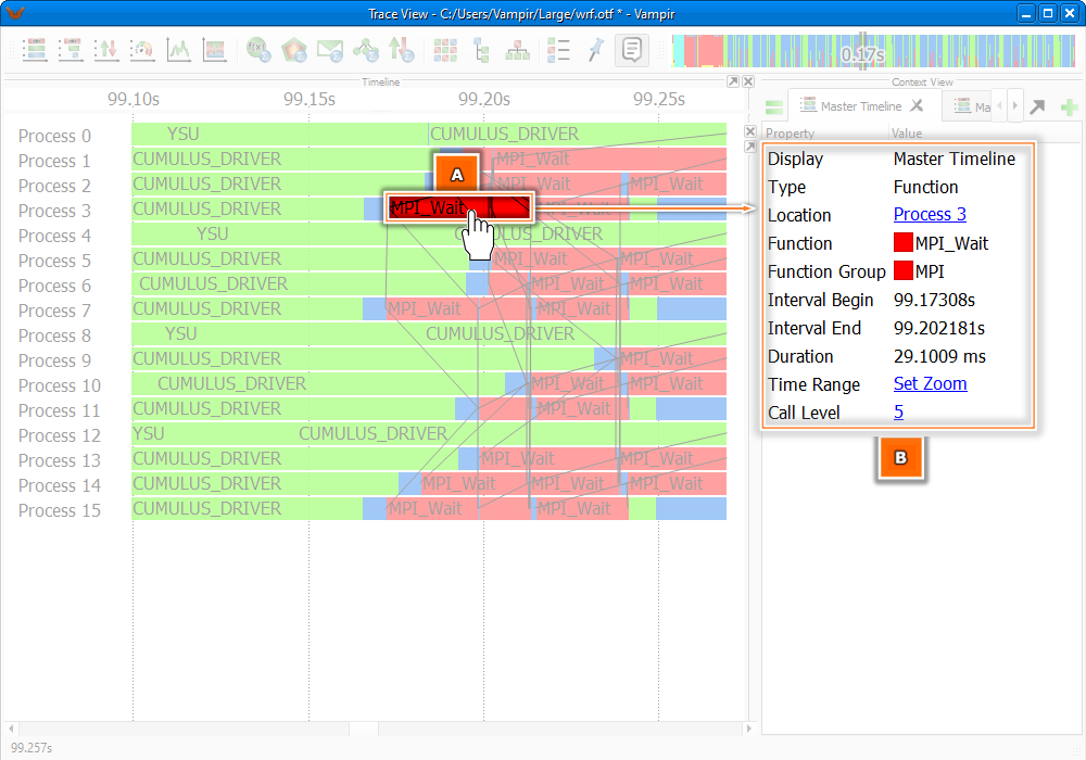
Context View, showing context information (B) of a selected function (A)
An object, e.g., a function, function group, message, or message burst can be selected directly in a chart by clicking its graphical representation. For different types of objects different context information is provided in the Context View. For example the object specific information for functions includes properties like Interval Begin, Interval End, and Duration, shown in Figure LINK. Objects may provide additional information for some items. In that case such items are displayed as links. A click (double-click on OS X systems) on the link opens a new tab containing the additional information.
The Context View may contain several tabs. A new empty tab can be added by clicking the +-symbol on the right hand side. Information of new selected objects are always displayed in the currently active tab.
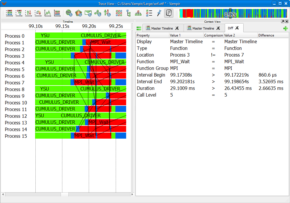
Comparison between Context Information
The Context View offers a mode for the comparison of information between tabs. The =-button on the left hand side allows to choose two objects for comparison. It is possible to compare different objects from different charts. This might be useful in some analysis cases. The comparison shows a list of common properties along with the corresponding values. Differences are displayed as well. The first line always indicates the names of the respective charts, see Figure LINK.